Category Archives: art

An abstract print from a tree trunk scar

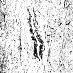
The two parts of this scar on an Aspen tree trunk reminded me of a painting I had made in 1979:

I changed the colour image to greyscale, then generated several bitmaps at different thresholds to posterize the image:

First I printed a gradient background:

Gradient backgrounds drying.

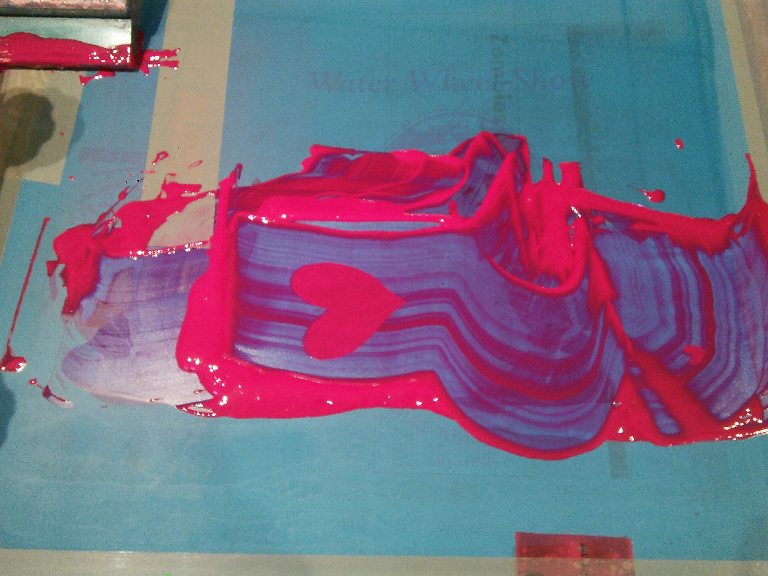
I wanted to transform the image into something that might echo the legacy of mining in northern BC, so I used metallic inks, as well as intensely pigmented colours. As with the Babarrunak Raku print I had made previously, I built up surface texture with repeated passes of clear ink. Here is the final image:

“Ore”, silkscreen 4″ × 5″


Closeup view

Update:
“Ore” has been accepted into the 8th Tokyo International Screen Print Biennial exhibition. Award-winning prints are posted here.

Reflecting on Chinese Cariboo history through printmaking

Claire with a candle for Tiananmen at Chinese Cemetery.

Last spring (& again this year) we visited the Chinese cemeteries in Stanley and in Barkerville to commemorate the Tienanmen Square massacre and to reflect on the courage of those resisting tyranny in Hong Kong. When anti-Asian incidents began to increase in the Lower Mainland after the onset of Covid, I wanted to illuminate some of the Cariboo’s Chinese history through printmaking. “Stanley Doorway” and “Chinatown Wall” are the first of two such prints. I began them last summer and finished them this spring.

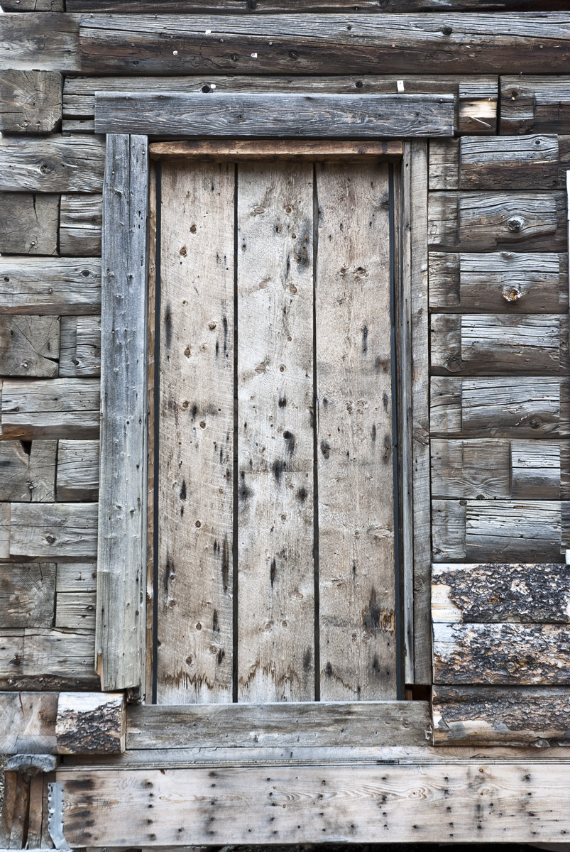
The Lightning Inn still stands in Stanley. The doorway caught my attention:

Stanley doorway photo

To make a multicolour posterized screen print, I created a series of bitmaps of the image in black & white at various thresholds:

Thresholds of doorway for posterization process

After printing a warm gradient background, I printed the darkest threshold with a transparent brown ink:

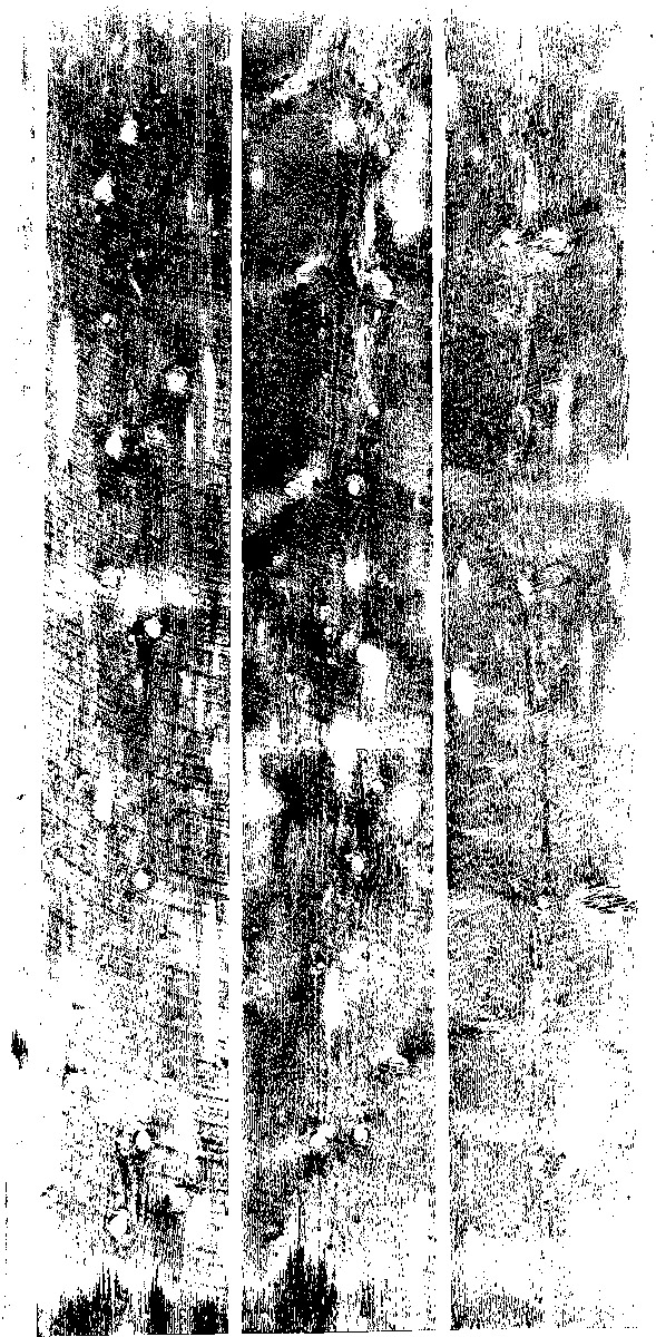
To add transparent gold on some the doors, I reversed out the centre highlights to make a film positive with this pattern:

Reversed positive for centre of door

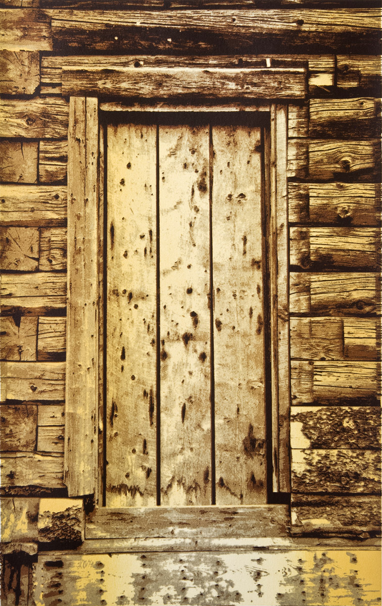
Here is one of the final prints:

Stanley Doorway – silkscreen 斯坦利

Barkerville’s Chinatown has many restored and recreated buildings:

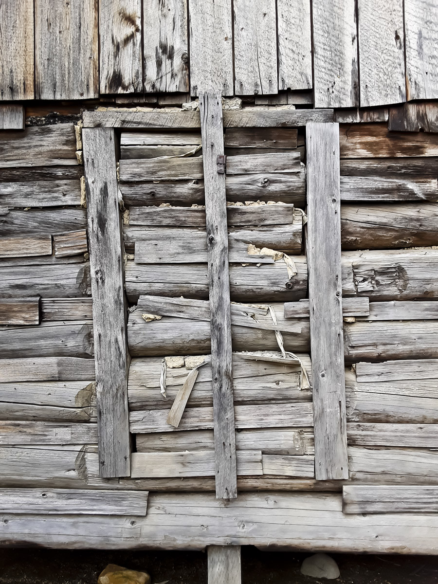
This particular wall caught my eye:

A wall in Chinatown

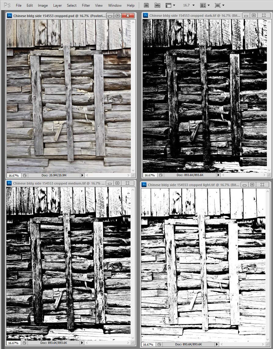
Following the same process I used for the Stanley Doorway print, I generated a range of thresholds from a black and white version of the photo above:

Thresholds for posterization process

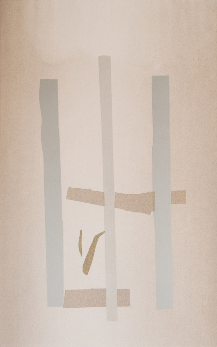
I began with a transparent gradient background, then hand cut rubylith masking film to make stencils for these colour fills before printing the photographic stencils. Some prints have 2 gold shapes like this one below; others have 4.

Background gradient + 4 underprint colours

Here are the final prints:

Chinatown wall – silkscreen with 2 gold shapes
Chinatown Wall – silkscreen with 4 gold shapes

For first hand history of Stanley and Wells, see “…And So…That’s How It Happened – Recollections of Stanley-Barkerville 1900-1975” by W. M. (Bill) Hong.


In 2008 and 2009, a group of us skied between Barkerville and Stanley (approximately 25 km) along the original Cariboo Waggon Road. We named our trek “The Cariboo Jack” to honour Wong Man Ding (akak Cariboo Jack), who had walked all the way from Yale to Stanley in 1868. I screen printed bibs like these on Tyvek for all the skiers:


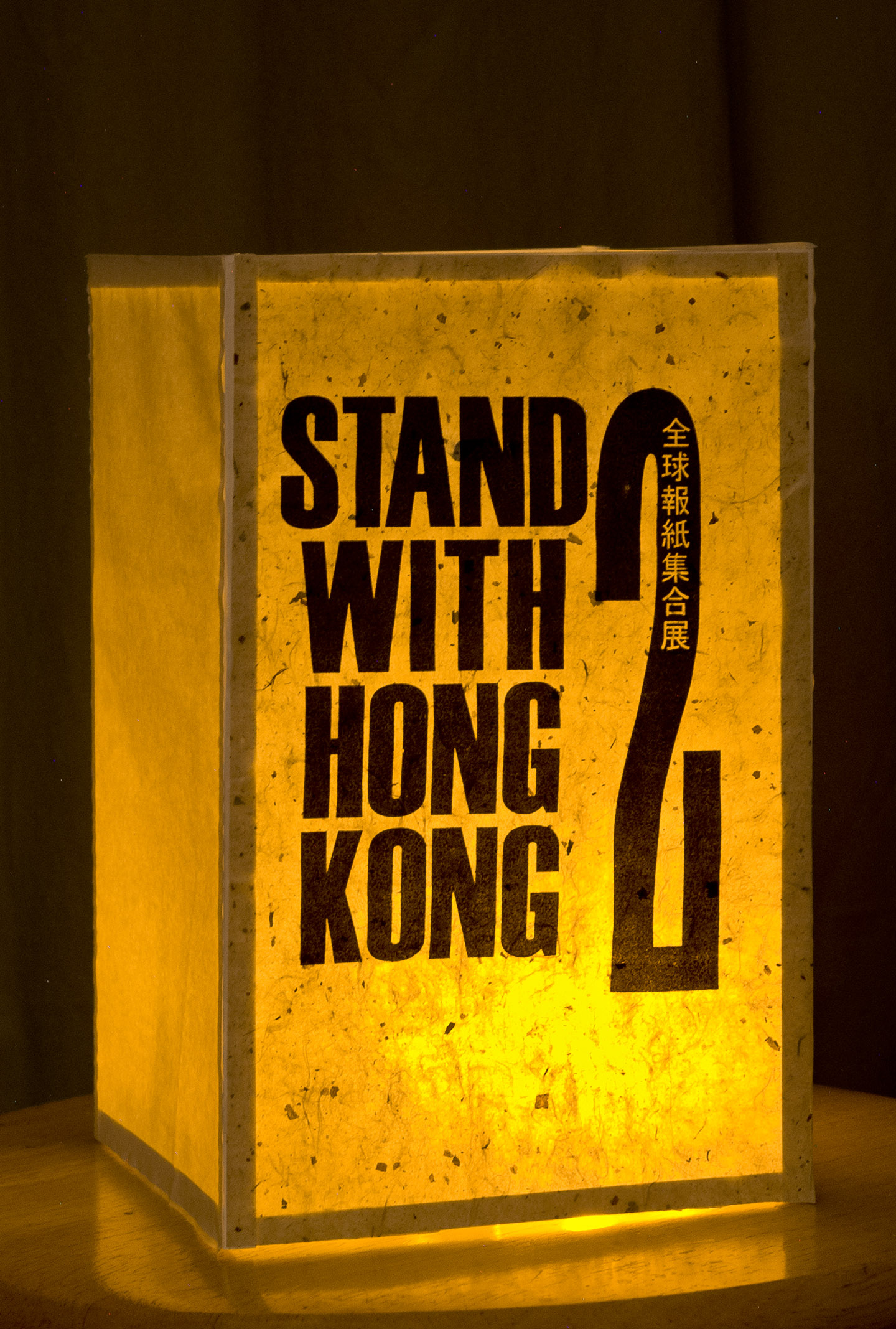
When the Chinese government began cracking down on pro-democracy groups in Hong Kong, I printed paper lanterns for the Autumn Moon Festival with this design from the Hong Kong Artists’ Union:

Paper lantern, screen printed

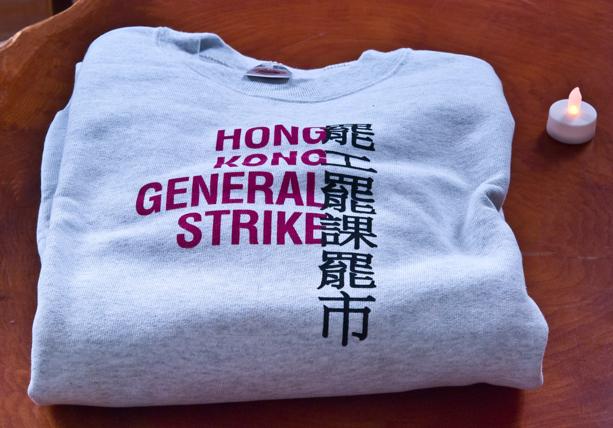
… and then another of their designs onto shirts and scarves.

Screen printed sweatshirt


Foil Transfer Test

gold and metallic blue foils

This winter I obtained a sample of a water based screen printing foil adhesive and some short lengths of gold and metallic blue foil from our friends at Willox Graphics in Burnaby. I’d read about foil transfers before, but never had a chance to try them out until recently.

Gen IV foil adhesive

For my test, I made a simple stencil of snowflake patterns that I had previously printed on necktubes for the Cold Snap Festival during the 2015 Canada Winter Games in Prince George. I chose a screen with LX-135 mesh that could print decent detail on dark fabric. It’s a cool new kind of mesh that can print a heavy deposit of ink while retaining detail.

Snowflake stencil

The foil transfer process is simple: print the adhesive on some fabric and let it air dry overnight. The next day, I put the sample prints in our heat press under pressure @300F for 12 seconds with foil sitting on top and a silicon release sheet on top to protect everything from the hot platen. After allowing them to cool, I peeled the foil material which left shiny gold and metallic blue where the adhesive retained them.

Next time I will make an extra-thick stencil by recoating a previously coated, dried screen. This will make it easier to print a heavier deposit of the adhesive and – theoretically – obtain more consistent adhesion. And I might use a design with less finicky detail! But this was an enjoyable experiment.

Printing textiles with water based inks

Ink companies have developed many alternatives to solvent based systems for screen printing. Thanks to water based inks, I am still alive and still printing!

Printing water based gold ink on fabric patches at our popup tent. Wells, August, 2017. Chelan Kujundzic photo.

Although Plastisol inks remain an industry standard in garment printing, I’ve mostly avoided using them, because of the need to wash up using Varsol. Not as toxic as acetone or “screen wash” or – shudder – lacquer thinner, but still an exposure risk. They can also result in a rubbery print surface. On a shirt, that can feel like wearing a vinyl place mat!

Recently I’ve been using TW’s TAL series of water based inks. These restrict me to light coloured cotton shirts, because they have a lot of transparency and will disappear on dark garments. They can dry quickly on the screen and sometimes need retarding, so once you start printing, you need to continue, unlike Plastisols that do not dry until heat-set. Don’t answer the phone or door bell if you are printing with these inks!

These inks bond best with natural fibres, so they’ll probably fade out more quickly if printed on shirts with a high polyester content. But they have a wonderful, jelly-like consistency which is fun to print. Best of all, though, these inks – more like textile dyes – penetrate the natural fibres and leave a soft, easy-to-wear surface.

ICC‘s Gen IV series are a kind of water based alternative to Plastisol inks. Unlike the TAL series, these inks – if retarded – allow you to step away from a job and resume printing within a reasonable period of time. They print nicely on dark coloured fabrics, especially if flashed and printed a second time. Adding a small amount of “puff” can help increase their opacity on dark fabric (thanks to David Cran for this tip). Here are short video clips of two shirts I printed with these inks: Wǫchiigíi and Mamahtâwisîpiy.

All of the above inks require heat-setting to cure and withstand laundering. Temperatures and times vary; allowing the ink to air dry overnight is critical. This allows any water to evaporate prior to curing.

TW has another series of water based inks, the Safeflex series. These remind me of the incredibly thick, stiff Flock Adhesive (solvent based) I worked with many years ago. They cure at very low temperatures and seem to stick to any kind of fibre, including synthetics. Safeflex inks dry quickly and need retarders for prolonged print runs.

Permaset from Australia and Virus from Italy make excellent water based textile inks, too. Printed, flashed, and printed again, this yellow has plenty of opacity, even on black cotton. Like the Gen IV and the Safeflex inks, it bonds with the fibres and has a slightly rubbery feel.

Willox Graphics has been my main source of inks for many years. They provide outstanding technical support for which I am immensely grateful.

Echoes and rhymes in art, espresso and nature

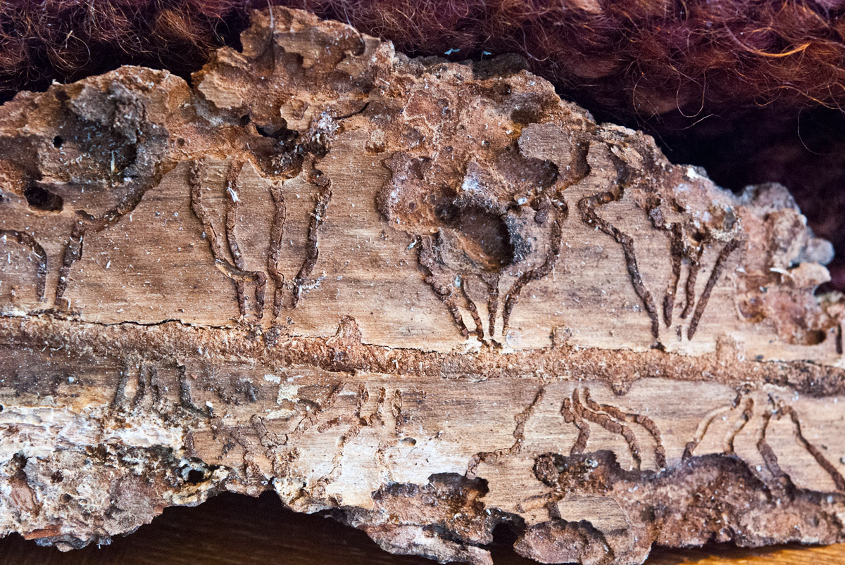
This silkscreen print emerged after I had made several prints based on pine beetle galleries. I started with a colour photograph of a blaze cut into tree bark on the trail to Mount Murray, just outside Wells.

Blaze

Photo of blaze scar on tree, Mount Murray trail near Wells.

After changing it to greyscale, I “posterized” the image with five tonal thresholds.

The next step was to generate film positives and make photostencils.

The first screen was a split gradient for a solid, printed background. Then I printed the darker positives with lighter inks and vice versa until I ended up with this:

Blaze

“Blaze” – silkscreen, 12.875″ × 16.75″ (32.5 cm × 42.5 cm)

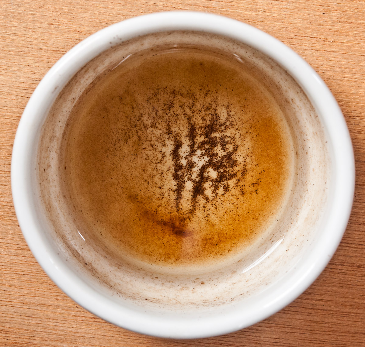
Months later, while making an espresso in the gallery, I looked down at the drip bowl that sits under the machine and saw this:

Coffee grounds in Billy Bowl 0611

Espresso grounds in drip bowl.

Ok, not quite the same pattern and colours as the silkscreen print, but a visual cousin 😉

Back to the pine beetle bark.
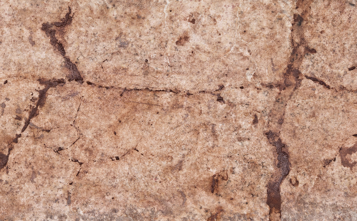
This section intrigued me; something seemed familiar.

Banff bark0106

Following my same work flow, I changed the photo to black and white, posterized it, then created the film positives to make photostencils.

Here’s the resulting print:

Banff Beetles

“Banff Beetles” – silkscreen print 4″ × 6″ (13.3 × 7.9 cm)

Which reminds me of this view of Cascade Mountain as seen from downtown Banff, Alberta:

cascade-mtn-in-banff-banff

Cascade.

Again, not quite the same, but reminiscent enough for me 😉

Peace River Screen Printing Workshop trip

After much anticipation and preparation (see “Peace River Screen Printing Project” post below), Claire and I packed up the car and drove to Fort St John on May 11 – about an eight hour trip. This is a fine time of year to drive north, not just because there’s so much daylight at our latitudes, but also because the remaining patches of snow in the northern Rockies delineate the contours of the mountains that tower over the Pine Pass in their undulating folds.

We don’t drive as fast as Google.

Verena Hofmann welcomed us to the Treaty 8 Tribal Association building in FSJ upon our arrival and helped us unpack. The T8TA building has wonderful spaces for meetings and we set up in the back where we could access water, as well as the back parking lot for sunlight photostencil exposures. We were honoured to be able to hold the workshop there and very appreciative of T8TA’s support, as well as Verena’s organizing assistance.

In addition, we were given permission to stay at the Tse’K’wa house above the cave at Charlie Lake. It was an enormous privilege to stay in this very special, significant place. To see the cave is a powerful experience and we’re grateful to have had that opportunity.

We had a small, but enthusiastic and extremely productive group in the workshop, with various friends dropping in over the course of the weekend. On the Saturday, we explored hand-cut and torn wax paper stencils, simple registration systems, printing gradients, and then coated screens with photoemulsion so they could dry in a dark closet overnight.

On Sunday morning, the weather was still perfect for exposing these in sunlight outside the back door. The first exposures took about 12 minutes, but we shortened that gradually to 8 minutes as the day progressed. At one point we were able to test three kinds of film positives: a retouched photocopy on acetate, hand-cut rubylith film & hand-painted Fotostrip masking fluid. The weekend went by very quickly and the participants gave some really helpful feedback and ideas for ways to improve on it if we have the chance to do another. Thanks again to Verena and T8TA for hosting and helping to organize the weekend, to Matt, Donna and Claire for their participation, and to Nathalie and Reg for dropping in!

Sunlight exposure with 3 kinds of film positives.

Screens post-exposure hardening in the sun.

Once we finished packing up, we drove 15 minutes south to Arlene and Ken Boon’s farm at Bear Flat on the Peace River where they generously treated us to a lovely supper, breakfast, overnight cabin stay, and tour of their land and buildings. We hadn’t realized they had worked in the log building business, so having a chance to see some of their handiwork – especially their creative renovations and reconstructions – was inspiring. Their museum houses many precious items, including a photograph of a horse-drawn plane for planing logs into timbers. We didn’t take any photos inside; you have to go there to see it!

Arlene and Ken were planting corn when we left – a crop not possible to grow in many places north of Quesnel! From Bear Flat we drove back through FSJ and east of Pouce Coupe to Demmit, just inside Alberta to visit Teresa and Peter von Tiesenhausen. Just as we arrived, they plugged in a brand new 10 KW array of solar panels on a new timber frame structure. Very exciting to watch their electrical meter start to go backwards!

Teresa kindly took us on a tour of the Demmit Community Hall. She and Peter were instrumental in the planning, fundraising and construction of this beautiful timber frame & straw bale building. An inspiring, successful project on every level.

From Demmit we made our way back to Gundy for an overnight visit with Verna Savor and Rick Broswick who moved there several years ago from Wells. It was a pleasure to catch up with them as well as enjoy their usual big-hearted hospitality.

After a short pit stop in Dawson Creek, a visit to the art gallery and a short chat with the Curator, Kit Fast, we were back on the road in time to return to Wells at sundown. In our last hour on Highway 26, we saw five black bears and one porcupine – a beautiful ending to a wonderful trip.

Special thanks to our many friends and Chuffed donors without whose support we could not have held the workshop or made the trip!

Under the Field

After bringing the field of yellow mini-stakes back from the Far Afield exhibition at Omineca Arts Centre (see the previous two posts), and after having it on display with “Reservoir” at Amazing Space Gallery here in Wells through the summer, it was time to dismantle it. The dried, unfired terracotta clay can be reused one day. I can cover the canvas board framed in reclaimed fir with fresh clay if the opportunity arises again to replant the stakes and add more to the many voices resisting the Site C dam on the Peace River. It can have another life.

Pulling up the stakes revealed a lovely pattern left by the donors and other contributors when they pressed their stakes into the wet clay, as well as the cracks formed by the clay as it dried.

Stake in the Peace dried field

Dried terracotta field beneath “Stakes in the Peace”.

Removing the chunks of dried clay from the supporting canvas board revealed yet another pattern, this time similar to a watershed.

Stake in the Peace - under the dried field

Under the dried field; terracotta on canvas.

Scraping and rinsing the remaining clay exposed a subterranean drainage pattern.

Stake in the Peace - under the dried field

Under the dried field; terracotta on canvas with fir frame; 48″ x 16″.

Stake in the Peace - under the dried field

Under the dried field (detail).

Stake in the Peace - under the dried field

Under the dried field (detail).

To keep up to date on efforts to stop the Site C dam, see this Facebook page (one of  several), Sierra Club’s site, or follow The Narwhal‘s investigative reporting on this and other issues. And the stakeinthepeace campaign.
To learn about the BC Utilities Commission hearings on Site C, to attend a hearing or to make a submission, see their site here.

Decompression in Deba

Our Air France flight landed in Paris on Easter Monday morning. After being thoroughly frisked when my Mountain Equipment Co-op backpack tested positive in Charles de Gaulle airport’s security, we shuttled our way to another terminal for our afternoon connecting flight to Bilbao. The small number of banana-shaped couches were occupied, so we tried sleeping on the floor, but general noise, cell phones and announcements made that difficult.

It was a relief to land in Bilbao, bus downtown and check into the family-run San Mamés Guesthouse. Ekaitz helped us haul our suitcases up a couple of short flights of stairs to reception where we were able to leave the larger items containing our exhibition pieces, and took our lighter luggage up the elevator to our room.

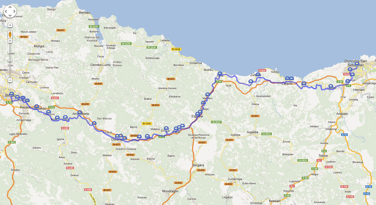
Next morning, we took the tram to the Euskotren station and took a train east to Deba.

The main Euskotren route (does not show the Gernika/Bermeo spur line).

The main Euskotren route (does not show the Gernika/Bermeo spur line).

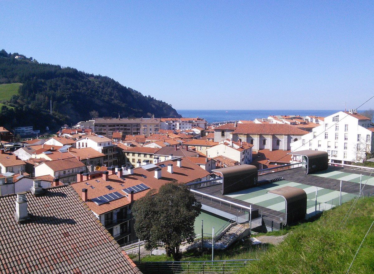
Deba.

Deba.

The Zumardi Pentsioa is only a few blocks from the train station and just a few stairs from the street to reception. Deba is a lovely, quiet town on the coast with a sandy beach and a pedestrian zone in the old downtown. After such a long time in transit and a nine-hour time difference, we were keen to walk, rest and recuperate. There were plenty of places to shop for picnic items, as well as many bars with tantalizing pintxos.

Organic bakery, Deba.

Organic bakery, Deba.

Claire in front of a palette mural in Deba; “erakusketa” is Euskara for exhibition.

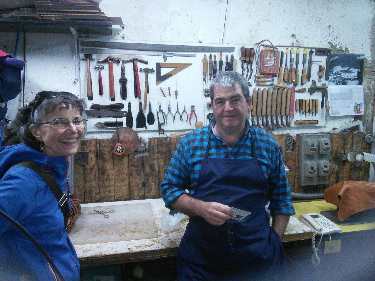
The display of hand made slippers in one store window caught our eyes, and there we met Mikel. He has been making shoes for over 31 years and produces much of the traditional Basque footwear used in festivals and folkloric events throughout the region. He kindly gave us a tour of his workshop which was filled with rolls of various kinds of leather, templates, tools and shoes of all sizes. He also makes beautiful stamped leather boxes.

Claire with Mikel in his shop.

Claire with Mikel in his shop.

We chatted about what it’s like to work as an artisan or artist, the risks of repetitive strain injuries, and making a living in a globalized economy. It was the first of many encounters with people who generously welcomed us into their lives.

Traditional footwear in Mikel's shop.

Stacks & shelves of traditional footwear in Mikel’s shop.

Templates for various kinds of shoes and sizes in Mikel's shop.

Templates for various kinds of shoes and sizes in Mikel’s shop.

How to make sequential, coded labels with Excel & Illustrator

Claire in the artist market tent.

Claire in the artist market tent.

Each piece of artwork and merchandise for Claire’s display in the Artist Market at the Canada Winter Games in Prince George was required to have unique, coded labels. This was to help any volunteers at the checkout keep track of sales. I knew I could generate unique sequences of identifier codes using Excel and print them from a Word label template, but I wanted to include a colour logo and apply styles that might be awkward to achieve in Word.

InDesign and QuarkXPress can import Excel spreadsheet data, but I couldn’t find label templates for them. Although Illustrator doesn’t import easily from Excel, it does have label templates and its tools offer lots of precision, so I decided to work with Illustrator and Excel.

I started by creating a sequence of unique identifier codes in Excel, by making two numbered cells in a row, selecting them, then grabbing the +sign handle and dragging the selection down to create a numbered sequence as long as I wanted.

Starting a code sequence in Excel.

Starting a code sequence in Excel.

Second code entry to generate a sequence.

Second code entry to generate a sequence.

After selecting both cells, the cursor will change to a + sign when hovering over the bottom right corner.

After selecting both cells, the cursor will change to a + sign when hovering over the bottom right corner.

Pulling the + handle down starts generating a sequence of code numbers.

Pulling the + handle down starts generating a sequence of code numbers.

Then I opened a label template (Avery 5167 – 80/sheet) in Adobe Illustrator.

Avery label 5167 template imported into Illustrator: 80 labels/sheet.

Avery label 5167 template imported into Illustrator: 80 labels/sheet.

On a separate layer, I placed the Canada Winter Games logo that we were authorized to use, and the price for Claire’s art magnets we wanted to label and track. I locked these layers so I wouldn’t risk accidentally moving any of those elements, then created a new layer for the codes.

Prices and logos placed on each label.

Prices and logos placed on each label.

Illustrator layers for setting up labels.

Illustrator layers for setting up labels.

Next step was to create a text container box in Illustrator, then make 3 copies of it.

Creating a text box in Illustrator that is roughly the same height as an existing column of labels.

Creating a text box in Illustrator that is roughly the same height as an existing column of labels.

Four identical text boxes placed over the label columns.

Four identical text boxes placed over the label columns.

Back in Excel, I selected my column of sequenced code from CMK-mag-1 to CMK-mag-80, clicked Copy, moved to Illustrator, selected the first text box with my Area Type Tool, and Pasted the string of code into the box.

Importing sequential code data into a text box in Illustrator.

Importing sequential code data into a text box in Illustrator.

Of course, I needed to increase the leading so each code would land in the same position on each label.

Formatting a column of text in Illustrator to adjust font, leading, colour, etc.

Formatting a column of text in Illustrator to adjust font, leading, colour, etc.

Once that was fixed, I selected all four text boxes, went up to the Type menu, selected Threaded Text -> Create. (This is the equivalent of linking text boxes in InDesign or QuarkXPress.)

Creating threaded text boxes in Illustrator.

Creating threaded text boxes in Illustrator.

After adjusting the bottoms of a couple of text boxes, all 80 code numbers fit into the same place on their own unique labels.

All four text boxes filled and linked with sequential code.

All four text boxes filled and linked with sequential code; the third column needed to be shortened to bump its bottom entry to top of the fourth column.

I was ready to print to a Postscript laser printer.

There’s probably a way to accomplish this in Word, but this was a lot easier. Having built the file in layers, I am able to quickly build variations with additional Illustrator Pasteboards. And it was easy to select codes and prices to create  master inventory sheets in Illustrator for the checkout.

A second pasteboard added to the Illustrator file, then filled with a continuing sequence of codes.

A second pasteboard added to the Illustrator file, then filled with a continuing sequence of codes.

I now realize that I could also create custom, graphic-rich labels in InDesign and QuarkXPress by saving an Illustrator label template as a PDF, importing it into ID or Quark, then designing my labels on a separate layer above. A key challenge is to have the printer deposit its ink or toner exactly within the label perimeters, not overlapping the edges, and this process should offer the same precision as my Illustrator-Excel workflow.

Stillness of Winter

Extreme cold draws moisture out of the air until it sparkles with minute ice crystals. Underfoot, snow crunches like styrofoam. The cold acoustics seem to carry sound farther, even though deep snow muffles it.

Snow begins to cover everything, then hoar frost starts growing new shapes and textures, different each day due to wind, sun, snowfall and temperatures.

Willow winter cotton - made of fresh snow.

Willow winter cotton bolls – made of fresh snow.

Crystal blossoms on creek, fall 2014, Wells.

Crystal blossoms on creek, fall 2014, Wells.

Palm-sized crystal blossoms on creek, fall 2014, Wells.

Palm-sized crystal blossoms on creek, fall 2014, Wells.

Puppet tree - dressed in fresh snow.

Puppet tree – dressed in fresh snow.
I find it difficult to leave these scenes, especially knowing many fragile forms may be gone the next time I return.

Slide Mountain alpenglow, fall 2014.

Slide Mountain alpenglow, fall 2014.

Eventually the cold temperatures send me home to defrost my fingers. Setting sunlight on Slide Mountain warms my eyes along the way.